Web users prefer a mobile optimised site for shopping and browsing, but expect the same brand experience they would find online or through other channels, according to a new study.
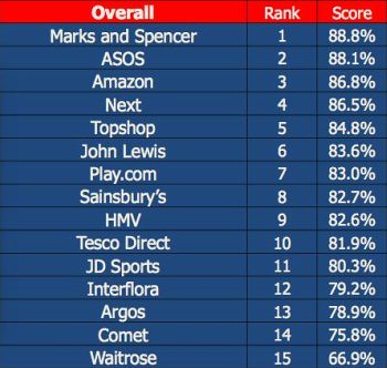
The mCommerce Benchmark study by eDigital Research finds that satisfaction levels with retailers' site on mobile are improving, with M&S the top-rated mobile site.
It contains some useful insight into what users expect from mobile commerce sites. I've summarised some of the findings below...
What do users expect from a mobile retail site?
Homepage
The survey results suggest that users want simplicity from a homepage, yet it still needs to portray the brand. For example, the John Lewis mobile site was criticised by users as the homepage didn't contain the imagery that people are used to seeing on the main website.
Others are too complicated or confusing for users. The Waitrose homepage, though optimised for mobile, scored the lowest mark in this category.
This was because users found it hard to tell from the homepage what the site does and what it sells.

The top homepage in the category was Interflora, thanks to clear navigational links, use of imagery, and clear branding:

Navigation
Users expect to be able to browse and buy the same range of products on a mobile as they can on the main website, and this means that navigation has to work well.
ASOS was rated top for navigation, and this is because it manages to make it complex enough that people can select very specific product categories:
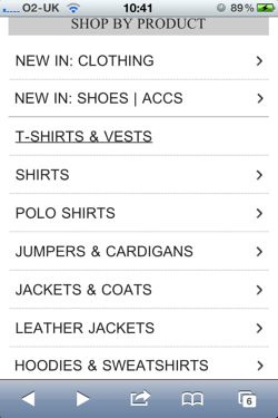
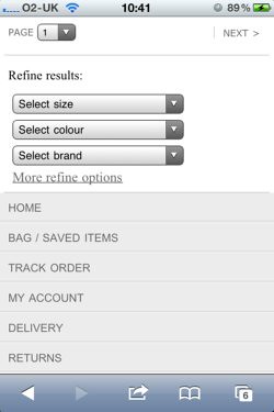
When a large range of products are on offer, it is vital that effective sorting and filtering options are provided, as these allow the user to narrow their selection, avoiding the need to browse through too many products.
Product pages
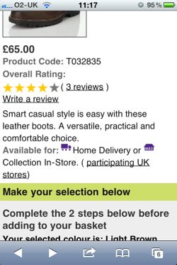
Product pages need to provide enough detail so that the user can make an informed decision about whether or not to buy the product. However, it's also important to ensure that product pages don't contain so much detail that they are slow to load or hard to scan and understand for users.
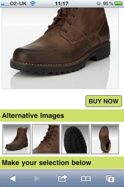
In this category, the M&S mobile site scored the highest marks, closely followed by ASOS and Amazon. This is because the M&S site manages to provide a very similar experience to the desktop version. For example, users can see multiple product images:
There is also plenty of information about the product, details of delivery charges and timescales, as well as user reviews:
Shopping basket
Despite the obvious drawbacks, standard desktop sites were rated higher in this category than those that had been optimised for mobile.
Next's shopping basket was picked out as an example of best practice, as customers could see all the information they needed to see, as well as being able to add and remove items.
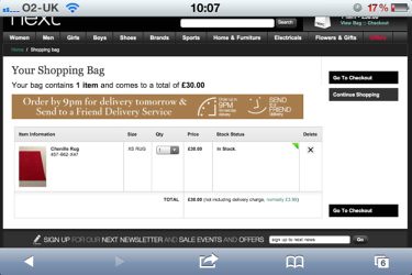
However, the rest of the Next site provides a very poor experience for mobile users, which makes its overall score of 86.5% in this survey seem very puzzling.
The lesson here for retailers is to make sure that the information and features that customers expect from shopping baskets should not be lost when they are optimised for mobile.
Checkout
A checkout process really should be optimised for mobile users, and it's no surprise that the top rated sites in this category were all from mobile websites: Amazon, M&S and ASOS.
Scores were lower in this category, as users became frustrated with having to negotiate checkouts that had not been designed for the small screen. The testers were also annoyed by mobile optimised sites without transactional capabilities, such as Comet and Waitrose.
Amazon provides an excellent example of how to do mobile checkouts, with a simple process that doesn't ask for too much information from users, and with clear forms:
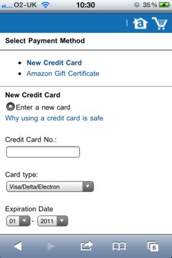
In addition, the fact that existing Amazon customers can login and use their existing address and payment details means the process can be very smooth indeed.
Conclusion
The survey is made up of 20 surveys carried out on each of the 15 retailers' websites. Each site was accessed from a smartphone, but not every site was necessarily optimised for mobile.
Some of the results are puzzling, such as the relatively high scores for some of the non-optimised sites like Next and TopShop (though both retailers do have mobile apps), but there are some useful insights.
One key takeaway is that mobile users expect the same experience and choice as they find on desktop websites, which means providing product details, multiple images and reviews, as well as information about delivery charges and timescales.
Also, the survey shows that websites that are properly optimised for mobiles work best, so retailers need to work on this, as mobile commerce will continue to grow this year.
The mCommerce Benchmark study can be downloaded via this link. (Registration required)
No comments:
Post a Comment