To buy or not to buy is the question. And a product page is where this crucial decision is made.
At (Visual Website Optimizer), we see an array of product pages being tested every day. While some people love to start testing with their “add to cart” button, others change copy, layout, and what not. Below, I’ve listed four super interesting case studies that go beyond the usual product page tests. You can use the insights they provide to boost the conversion rate of your e-commerce store.
Case Study #1: Social Proof Dilemma
Social proof helps to improve conversions. This is why many of you have social sharing buttons on your product pages. Right?
“If so many people are doing it, it must be right,” you think.
Honestly, it’s disheartening to see the mediocrity we sometimes confine ourselves to!
Thankfully, our customer Taloon.com decided to break free from this herd mentality. They called out the rampant trend of displaying social sharing buttons on product pages.
When they tested their original product page with social sharing buttons against the new version with no sharing buttons, their “add to cart” click-throughsimproved by 11.9%
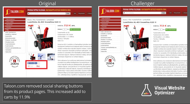
While 39% of digital marketers believe in the effectiveness of social sharing to improve website conversion rate, the data proved otherwise in this case. A couple of arguments can be made to justify why social sharing buttons are most likely a bad idea for product pages:
- They compete with the main conversion goal of the page (i.e., adding items to cart) and distract visitors from it.
- Unless it’s something exceptionally cool or exclusive, not many people like sharing a product page or landing page on their social profiles. So, the negative social proof actually can backfire in such cases. Who would want to buy a product that no one likes/cares about?
- They sometimes increase your page load times. Matthew, an e-commerce site owner, found that his Facebook “Like” button was adding 1.3 seconds to his page load time. (To support this with some data, every second of delay in page load time can reduce conversion by 7%.)
Considering the large number of websites that make this mistake, the humongous popularity of this case study doesn’t surprise us at all.
Takeaway: Chances are, your social sharing buttons on product pages are doing more harm than good. Even if you’re one of the few online brands that do receive social media traction on your product pages, I’d still strongly suggest that you run a quick test to see if it is working for you. Don’t forget to notice the change in your page load time, too.
Case Study #2: Which Matters More – Price or Authenticity?
Express Watches created a valuable test for their product page. Their original page confidently displayed their “Lowest Price Guarantee” badge to assure their customers they were getting the best deal in the market.
The new version they decided to test, however, replaced this price badge with the “Seiko Authorized Dealer” badge. The hunch was that authenticity of the product can be a more important concern for brand-loyal shoppers.
To sum up, it was a direct war between two primary concerns shoppers might have – price vs. authenticity. The question was: which is more important?

Before I tell you the test results, I want you to understand that the reason I decided to share this case study is because I want you to notice how the test result (whatever it may be) will give Express Watches a clear understanding about a crucial customer value.
Curious to know which version won? The version with the authenticity badgeincreased online sales by 107%
Unfortunately, that’s all we know about this test. I’m not sure if Express Watches utilized this customer lesson to tweak their marketing message. But, ideally, that’s what they should do to get the maximum benefit from their test/customer lesson.
For example, in this case, they probably could try persuading/selling to people using an increased emphasis on authenticity of the product (instead of price) and talk more about their authorized dealership in their PPC ads, emails, and other marketing channels.
Takeaway: A successful testing mindset goes beyond celebrating the highs and lows of test outcomes. Create tests that give you a clear customer lesson. They will give you the most impactful keys to unlock the success of your overall marketing messaging.
Then, use the information wisely in all your marketing channels, and you will reap benefits that go further than a successful A/B test, and for years to come.
If your website deals with branded products, don’t shy away from stealing this test idea. Price vs. authenticity – give it a shot!
Case Study #3: Cut the Clutter
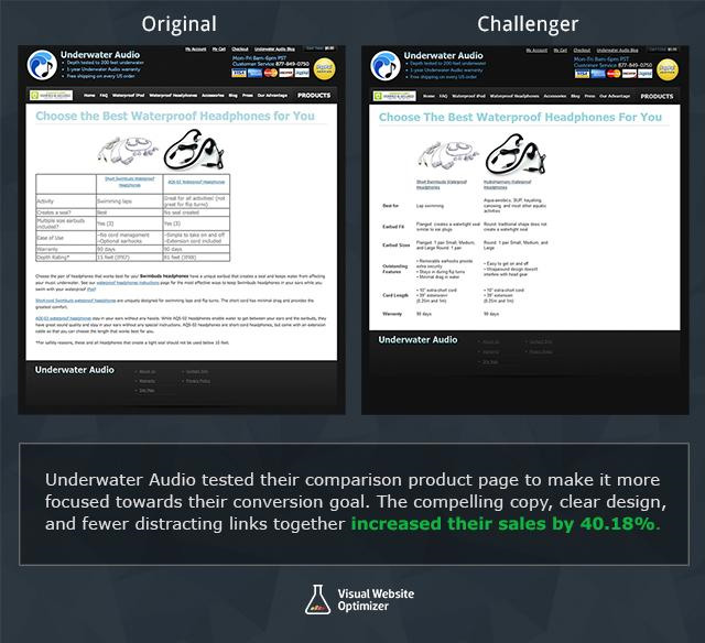
Underwater Audio’s product comparison page displayed a table drawing similarities and differences between their two waterproof headphone sets. The table was followed by a few short paragraphs that listed additional information about the products, along with some links to other pages, like “instructions to use waterproof headphones,” individual product pages of the two headphones, etc.
But somehow the page didn’t seem to engage visitors much. Here’s what Emily from Underwater Audio had to say about it:
“The (rather) unattractive table had information in terse phrases organized in no particular fashion (activity, seal, size, features, warranty, depth). The paragraphs continued below the fold and essentially repeated the table, with only a few unique additions hidden in the text. In short, it was not the most engaging page!”
They decided to remove the unnecessary information (from the table as well as the short paragraphs and links that followed) to keep the page crisp. And, some other interesting comparison points were added to the page to provide better value.
Result? The focused new page with no distractions engaged more visitors and beat the original. This spiked Underwater Audio’s online sales by 40.81%. Here are images of the two versions:
Takeaway: Recheck your product pages. Do they have any irrelevant links? Do they offer too much information that the majority of visitors do not need to make their purchase decision? Such unnecessary information can sometimes distract visitors from your conversion goal or might even overwhelm them. Cut the clutter on your page and A/B test it. Establish a clear eye flow on the page to help visitors easily scan the page.
Case Study #4: Compare with Your Competitors’ Prices
Paperstone is an e-commerce website in the UK office supplies space that competes with some big names, like Viking and Staples, in its industry.
When you’re competing with established brands, it’s important to pay close attention to what makes you a relatively better choice. And, it’s important that your prospects do not overlook it. Paperstone figured that the relatively cheaper prices of many of their products was what they could win with.
They showcased a small price comparison table on product pages, comparing their prices with two known brands in the industry. The table was placed right below the “add to cart” button so that visitors would notice it. This assured visitors they were getting the best deal. It’s important to note that these comparison tables were shown ONLY for products where Paperstone was offering relatively lower prices.
Here’s the new version with a quick-to-scan price comparison table added to a product page:
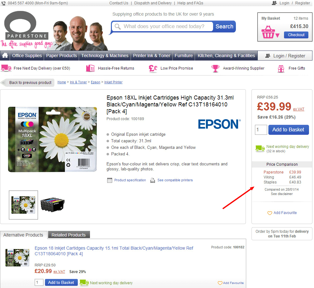
As expected, this extremely smart move by the company increased their online sales by 10.67%.
Takeaway: If you’re a small business competing with big names in your industry, find the one thing that should make your prospects buy from you instead of your competitors. Place it strategically so that your visitors do not overlook it. And, finally, test it.
If your competitive advantage is price, so be it.
Conclusion
The best part about optimizing this extremely important step of your conversion funnel is the wider reach and the manifold revenue impact when you A/B test them.
Also, site-wide product page template tests cumulate traffic, which is especially useful for low-traffic sites, making it easier for them to get conclusive test results in a shorter time period.
About the Author: Smriti Chawla works at VWO (Visual Website Optimizer), the A/B testing tool that helps you improve the conversion rate of your website. You can create experiments within minutes with their point-and-click editor. Sign up for their 30-day free trial here. For more inspiring conversion optimization examples,visit their case studies section. Follow Smriti Chawla on Twitter.
No comments:
Post a Comment