Every website has to performmaintenance at some point or another. Whether it’s just to upgrade a portion of the site or because of some problem with the site, it’s an inevitable fact of website ownership. And in many cases, maintenance requires taking your site offline for at least a few minutes.
So what should you do if your site is going to be down for maintenance? You don’t want users coming to a 404 or other error page. And hopefully you’d like to encourage them to come back to your site sooner rather than later, right? If that’s the case, you’ll need to build a custom maintenance page. Below we present a list of best practices to building effective maintenance pages that will help keep your visitors, whether new or returning, happy.
You may want to take a look at the following related posts:
1. Keep you maintenance pages simple and useful.
The entire point of a maintenance page is to let visitors know that your site is still around and that the maintenance is only temporary. It doesn’t need to do anything beyond that. Make sure it’s immediately apparent what your page is about and provides your visitors with the information they’re interested in.
Another useful function for simple maintenance pages is to include your maintenance message in multiple languages. The Web is global, and while many of your visitors are likely to speak at least some English, providing multiple languages is helpful. Just be wary of using online translators, as sometimes they’re less-than-accurate. The last thing you want your maintenance page to do is further confuse people, or worse – offend them.
This
Twitter maintenance page gives the bare minimum of information and keeps a simple design while still being inviting and friendly toward users.
…and sometimes Google Adsense just explains in plain language what is happening and when the page will be online again. Notice that Google also reassures the users that earnings will continue to be tracked as normal, and ad targeting will not be affected during this downtime.
This maintenance screen from the
Apple Store get to the point while still remaining casual.
MobileMe with a visually appealing maintenance screen in multiple languages (
via).
2. Realize it’s an inconvenience to your visitors.
When your site is down, your regular visitors are inconvenienced. It’s a simple fact. But don’t let inconvenienced visitors turn into alienated visitors. Simply acknowledging that your site’s downtime is a pain for your visitors is often enough to satisfy them. Apologize for the downtime, give them information that’s useful to them, and make them feel like you realize what this means to them.
Last.fm puts a big apology right at the top of their maintenance page.
Twitter takes a more light-hearted approach but still acknowledges that users might be getting impatient with the downtime.
3. Don’t be afraid to use humor.
There’s no need to get all serious just because your site is down. Using a bit of humor or otherwise making your maintenance page entertaining helps to improve your site’s image in the eyes of visitors inconvenienced by the downtime. Think about different angles related to your site’s content that could be portrayed in a humorous light. Whether it’s doing something with your site’s logo or mascot, or even something seemingly unrelated to your site, there’s surely an angle out there for making your maintenance page funny.
Etsy shows Halm working on the current technical problems. Notice that Etsy also communicated what’s happening and the estimated downtime.
Soundcloud promises to be up soon and uses a pun to make the maintenance page stand out (
via).
Ning uses a cute illustration and claims that its experienced technicians (pictured) are currently hard at work so as to bring Ning back online shortly (
via).
Reddit‘s maintenance page could use more information; Reddits probably shouldn’t have stopped using Lisp…
…and
YouTube seems to be busy pushing out some new concoctions and formulas (
via)
Flickr‘s maintenance page is not very informative, but funny. Flickr is having a massage.
FlashDen claims a 10 second downtime and offers up a cartoonish character doing maintenance on himself to make visitors smile.
Bloglines uses an image of a plumber to lighten things up when their site is down.
4. Give your maintenance page the same look and feel as your regular site.
You want visitors to immediately realize that they have arrived at the correct place, even if your site doesn’t quite look the same as always. If your maintenance page bears no resemblance to your regular site, many visitors may just assume they’ve gone to the wrong URL without bothering to read what your page says.
Make sure your maintenance page includes your logo and keeps the same general color scheme as your site. Even these two simple things can make visitors feel more at ease when they reach an unexpected page.
Grooveshark keeps their header and basic color scheme in tact.
StumbleUpon also keeps their header and logo in tact, and even the colors used in the illustration echo their brand colors.
Naturalinstinct uses the same color scheme and provides users with alternative contact options.
5. Let visitors know when your site will be back.
Maintenance times can vary greatly. Sometimes a site might be down for only a few minutes. Other times it could be an hour or two, or even longer. Let your visitors know what time you expect to be back up and running. This way they’ll have an idea of when to come back. An open-ended maintenance page encourages them to put a return visit off for hours or even days. Something that says you’ll be back in five minutes encourages them to do the same.
iStockPhoto‘s maintenance page informs its visitors about the estimated time when the site will be back.
Blogger uses a simple page that includes the time the site is expected to be back up.
Linkedin lets the users know when the site will return online (
via).
StudiVZ suggests to drink a cup of tea and informs the visitors that the site will be online at 8am (
via).
6. Provide recommended content.
Keeping a few articles from your site on a static page for maintenance downtime is one way to offer your visitors something to look at while you’re performing maintenance. Other sites even recommend content from other websites, generally that they think would be of interest to their visitors. Giving your visitors something else to do while they wait for your site to come back online is a great way to show them that you care, and that you realize it’s inconvenient for them (see number 2 above).
Librarything‘s “downtime” image suggests to read a couple of books while the site is down (
via).
Digg offers a list of other sites they thing their visitors might be interested in.
Github offers an entertaining YouTube video for visitors to watch while their site is down.
Mixx provides a few of their favorite “Mixxed” stories for visitors to check out.
Sears had to be closed for site enhancements during the Black Friday. The maintenance page provides users with further navigation options – such as Lands’ End, Parts Direct and Sears Credit (
via).
7. Invite your visitors to come back when the site is online again
Since your users actually have visited your service during the downtime, they, of course, would like to use the service. Therefore it makes sense to notify them when the site is online again. Obviously, you wouldn’t want to notify all users of the service that the site is back online. So it’s a good idea to make it possible for users to get notified when the service can be used again. The latter can be done either via e-mail, SMS or a tweet.
Soindustry makes offers its users to submit their e-mails to get notified when the site is online again.
8. Inform your visitors about the progress of the maintenance
Of course, many unexpected problems can occur during the maintenance, and it’s a good idea to keep your users informed about the progress. An instant feedback is important and let the user know that everything is going just fine and someone on the other side is working on the problem and that just a little portion of patience is required.
Habbo, a virtual world where you can meet and make friends, provides a sweet illustration on its maintenance page and also inform the visitors about the maintenance progress.
37signals also keeps the users updated about the status of maintenance (
via).
Further Resources
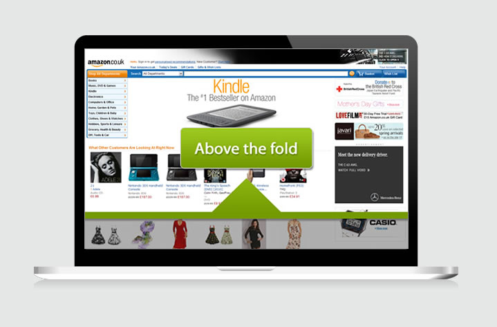
 Historically, "above the fold" refers to the upper half of a newspaper's front page, where the top news story and photograph are typically located.