By , March 21st, 2011 in Built Using Unbounce | 43 comments

After my last landing pages examples post (Your Landing Page Sucks – Here are 10 That Don’t), people asked for some examples from smaller companies. At Unbounce there is a giant pile of cool small-to-medium sized businesses that are creating landing pages every day, so I trawled through the community and asked some people to share their work.

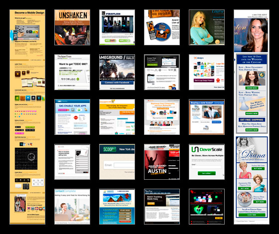
22 landing page examples created by Unbounce customers
Below, you’ll find 22 examples of landing pages that cover classic lead capture, product pre-launch/beta pages, ecommerce “buy now” or click-through pages and even a few microsites – and I’m stoked to say that they were all built using the Unbounce landing page platform. As usual, I’ve given them a mini critique to explain why I like them, and a couple of ideas they could use to optimize and test their pages for higher conversions.
Let us know what you think – provide your own critique in the comments
Because many of these companies are either new or small, I think it would be great if the community could dig in and provide their own critiques in the comments at the bottom. Conversion specialists, designers, usability, copywriters and marketers – perhaps you can make a name for yourself by lending a hand?!?!?Note: If you do comment, include the # of the page you are critiquing for easy reference.
A discussion about conversion optimization
My goal here is to provide suggestions that might help others to solve similar issues on their pages. But more than anything, I wanted to show some of the diversity that’s being created in online marketing.
They’re not perfect (what page is), but they all show something interesting and worthy of discussion (hint hint – comments please!).
See if you can spot any trends…
Click-Through Landing Pages
Click-through pages are exactly as they sound. An intermediary page where the purpose is to persuade visitors to click through to a subsequent page. They are sometimes calledjump pages or even romance pages.
Ecommerce Click-Through
A common use of click-through pages is to warm up prospective customers for an ecommerce transaction. The funnel conversion goal is the purchase of an item (perhaps a book or a mobile app) which will occur on the payment or cart page following the click-through page. As a result, the goal of your ecomm click-through pages is to convince people to “click a button” to buy your item – which will carry them on to the transaction page.
To be successful, ecommerce landing pages need to have enough information to allow the visitor to make an informed purchasing decision.
Key content includes:
- Product shots and videos shown in context
- Feature descriptions
- Testimonials
- Clear pricing
- Special offers (discounts)
- Time sensitivity – to create urgency
- Trust indicators: badges, accreditation’s and money back guarantees
These are some of the things I’ll be looking for along with the classic design techniques I referred to in “Designing for Conversion – 8 Visual Design Techniques to Focus Attention on Your Landing Pages“.
No comments:
Post a Comment